The Importance of Data Visualization
Everything we touch these days seems to create huge volumes of data. While buzz words like “big data” may have died off, the data itself remains. And when it comes to understanding, processing, analyzing, and communicating this data, the old techniques won’t cut it. It doesn’t matter how large your screen is, or whether it’s curved, that CSV you’ve imported into Excel is too much for anyone to understand.
Good visualizations can help us achieve improved outputs in less time. They also help us explain our work to colleagues, management, and customers. This post is a quick snapshot that introduces what data visualization is, why it’s so important, and how you can get started. So, let’s dive into it!
Data Visualization
Simply put, data visualization is the graphical representation of a set of information.
These graphical representations can take many forms. They range from simple bar, column, line, and pie charts to dashboards that contain multiple interrelated graphs to custom-designed visualizations. Each type of chart has various strengths and weaknesses. Similarly, different charts suit different types of data.
Importance of Data Visualization
It’s hard to overstate the importance of data visualization. There’s no denying that humans are visual beings. And that’s what data visualization taps into. It makes use of human perception and cognition to improve understanding. The visualizations make use of the human ability to detect changes in size, shape, position, quantity, and color.
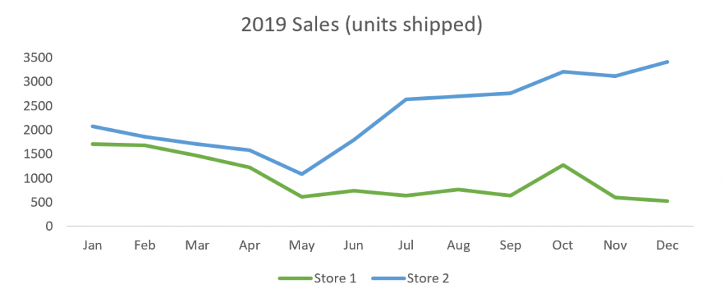
Let’s illustrate in practical terms with our old favorite, the made-up sales data (for all the people hoping I’d call on the Iris data set, it was too big to fit on the page). This data shows sales figures from two stores in a company. While we can see exact figures, it’s difficult to really understand what’s going on. And even harder to communicate it to others in our organization.
When viewing the same data with a visualization, it’s a completely different story. We can immediately see a few important details. There’s a downward trend until May in both stores. Store 2 recovered, and is even trending positively, while Store 1 didn’t. And October was a positive outlier in both stores. Sure, we can’t see the exact sales values, but we can always check back with the source data once we have a good understanding. Most importantly, we can easily communicate the data, so we can investigate why it’s happening and seize opportunities or solve problems with team members. Now imagine the difference if you extrapolate to more complex data sets.
In summary, data visualizations are important because they improve understanding by allowing humans to better process, analyze, and communicate information.
Getting Started With Data Visualization
The best way to get started with data visualization is to think about the visualizations you’ve seen in the past and to do your research. When you do this, you should find that there are patterns to when and where different types of visualizations are used. Once you’ve got this foundation, you can begin to think about your data.
To understand which visualization you should use, you first need to consider the type of data you have. Some example questions you may consider are:
- Is it nominal, ordinal, interval, or ratio data?
- Does it represent change over time or is it a snapshot?
- How many data points are there?
After you’ve considered questions like those, you need to consider the context.
-
- Are you visualizing to present information or to analyze and understand?
- Who are you going to be showing the visualizations to?
- Will you be present to explain and demonstrate?
- Are there multiple related data sets?
At this stage you’ll have a decent idea of how to present your data. To learn and find more training available, check out: Cprime Learning.


